Mobile App | 2021
Role: Product Designer
The Challenge
I live in Amsterdam and I cycle every day. Weather forecast plays an important role in my daily life. It's usually the first information I check on my phone.
Apps, however, often miss out an important bit of information: the "feels like" temperature. Without it, it's hard to decide how to dress! When they do provide it, the apps are often not beautiful enough to use.
If that is the first thing I'll look at on my phone, it'd better be a pleasant sight!
I decided to fix these problems by designing a new mobile weather app.
The Requirements
Have the temperature
Have also the feels like temperature
Provide further information about the weather in the next hours
Provide information about the next few days
Help the user feeling the current climate at a first sight
Be beautiful
Solutions
I started trying out different ways to display the immediate information on the screen.
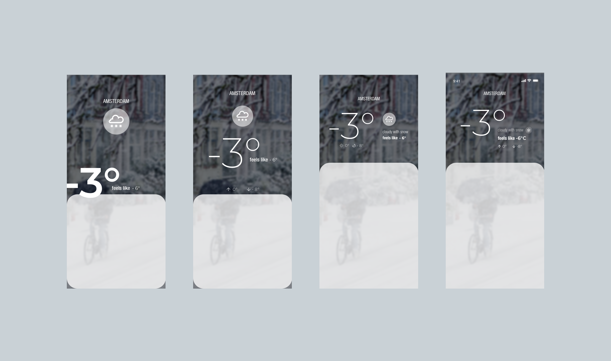
In these mockups, I considered the detail box opened, so the top space of the app would be smaller.
In this process, I tested different font weights, icons and how to organize the information on the screen in a way that would guide the users to read it how I intended it to be.
I decided, for instance, that even though a climate icon would help to get a sense of the weather, at the end, the whole UI of the app would give this indication, so the icon would be less needed. By making it smaller and more subtle, it gave more space and focus to the other information, removing distraction.
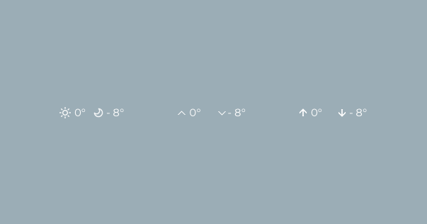
I explored different ways to display information such as max and min temperature. When testing with users, sun and moon icons - representing warmer (day) and cooler (night) temperature - weren't as clear as the arrows pointing up and down.
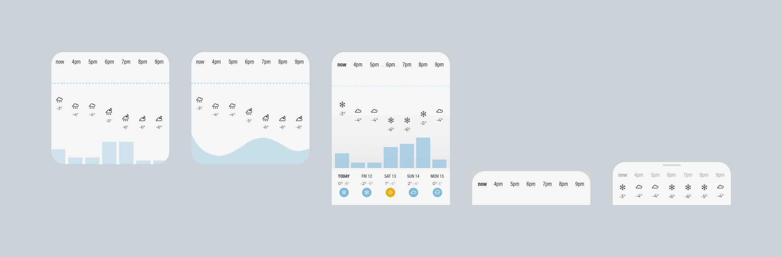
Next was to display the following details for the forecast: hours and days.
I tried several variations and explored the view based of different contexts in the app: when the detail box was collapsed and when it was expanded, what the user would see and how.
I decided, for instance, that by displaying the rain in several bars instead of one curved shape, users could better understand the precipitation for the whole day, as well as for a specific time.
Final Choices
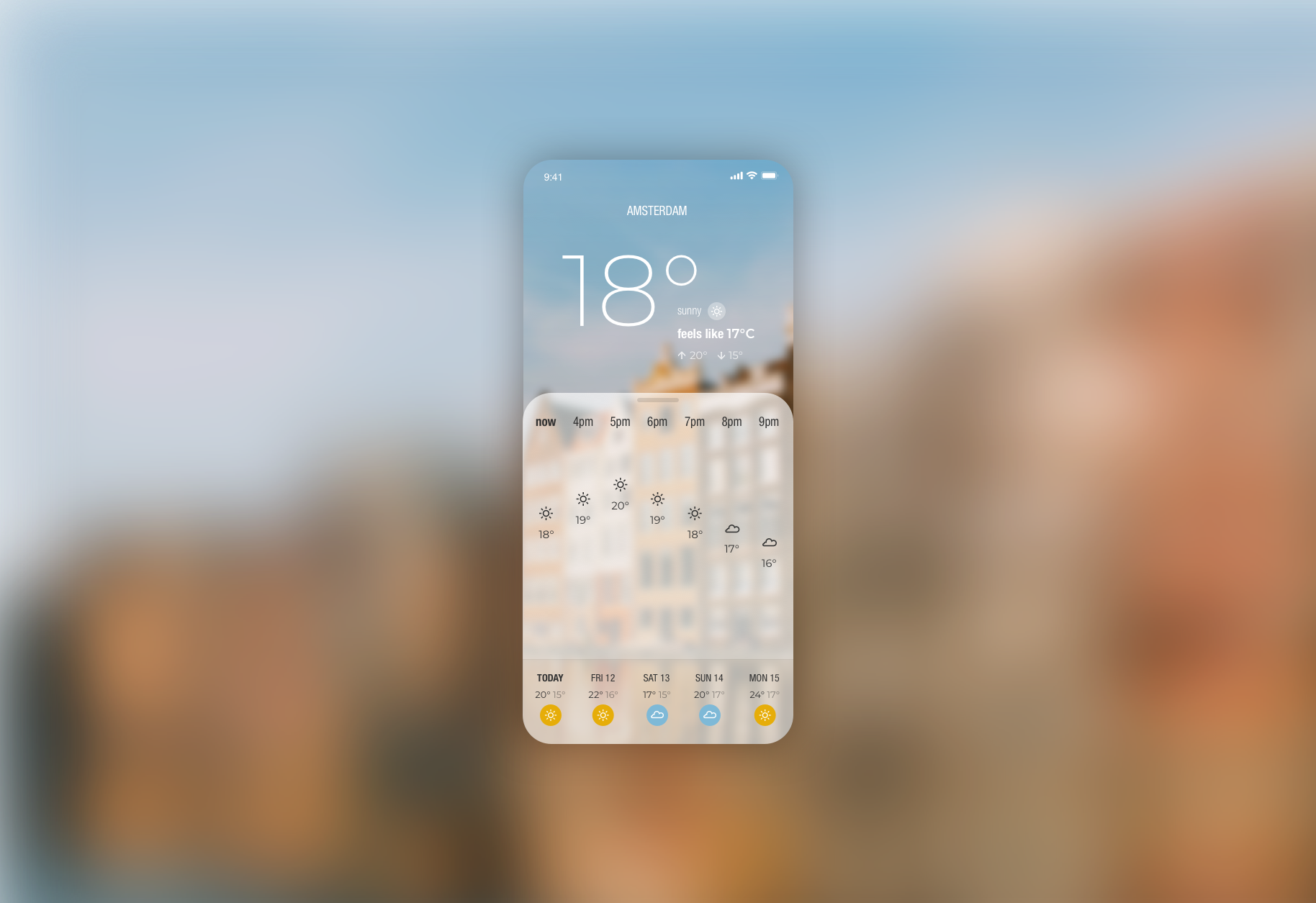
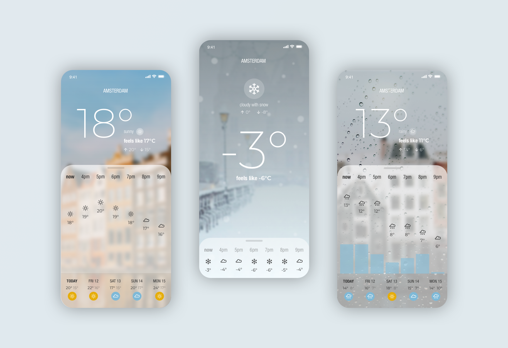
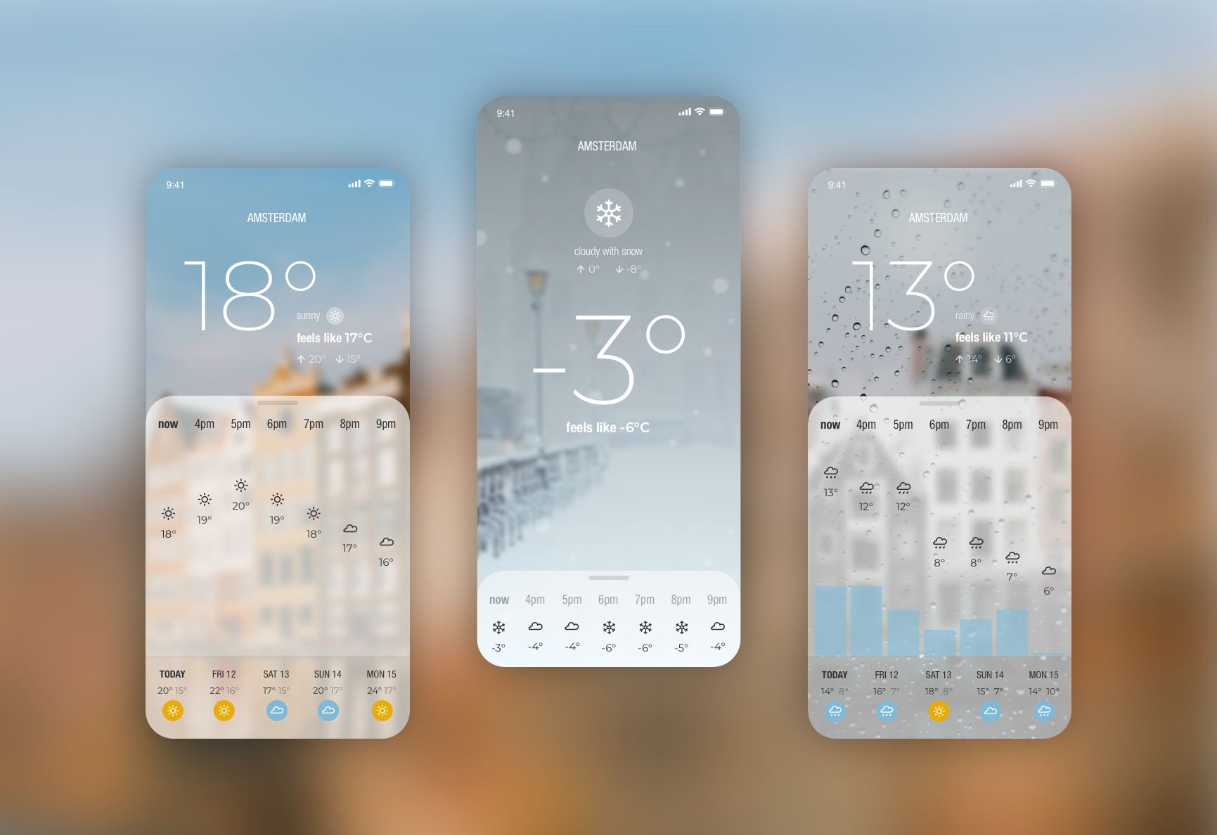
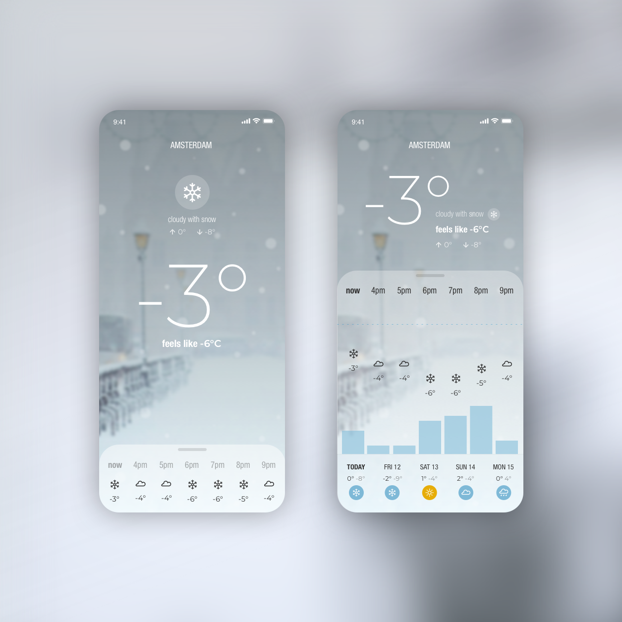
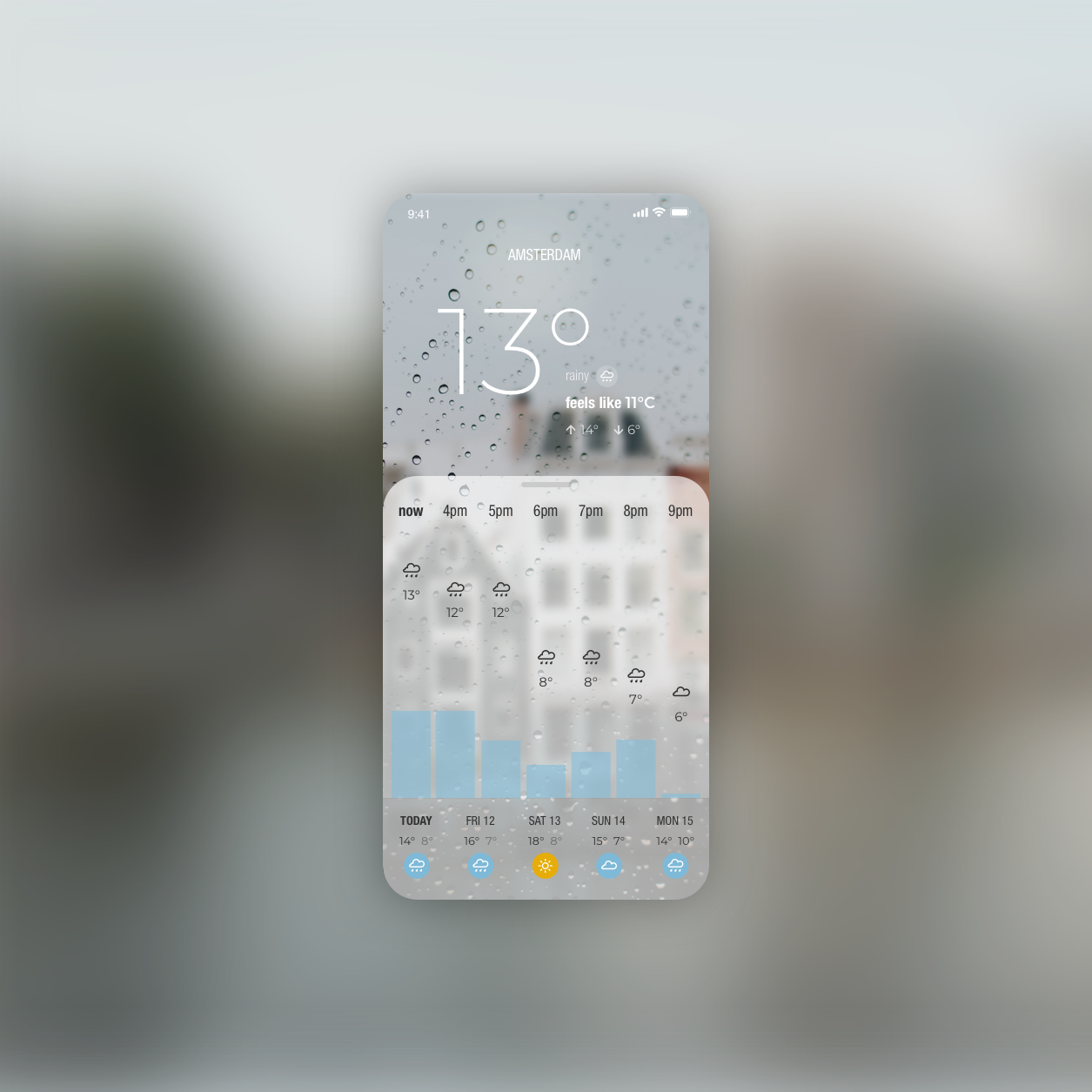
When the detail box is collapsed, temperature and feels like are highlighted at the centre of the screen, while a summary of the next hours is shown at the bottom of the screen.
The information is displayed in the right hierarchy, “temperature” and “feels like” can be seen at a first glance, while complementary information can be viewed next, such as max. and min. temperatures for the day and a description of the weather with a small icon to provide quicker understanding.
At the bottom of the screen, there's the summary for the next few hours. When the user expands it, they have a complete overview of the following hours and days in a clear infographic design.
I wanted to make users feel the temperature at first sight.