

Mobile and Desktop Platform | 2019
Role: Product Designer
The Challenge
The platform needs an audience - candidates searching for jobs - to apply for vacancies posted at Jump and, therefore, provide candidates to businesses. For a long time, though, the task of inviting potential candidates to apply for vacancies was made manually.
In order to scale the product (instead of the service!), Jump needed to generate organic traffic to the platform, to then convert visitors to potential candidates.
Requirements
When I first joined Jump as a Product Designer, in 2018, part of the platform wasn't public to users: professionals searching for a job had first to create an account, to then be able to see jobs.
I advocated for an open platform, believing it would provide a better and more transparent experience for our end-users, while also being able to attract more potential candidates through search engine, directly impacting conversions.
As a first step of this project, I changed the user-flow and Jump made the job feed a public page, so anyone could browse jobs with or without a Jump account. Next step was to attract more organic traffic to the page.
Research
In this project, I worked alongside the Product Owner, Marketing Team, Copywriters, Developers and SEO experts in order to achieve our goal.
Before designing the new job listing page, I made research on competitors and other products with similar pages: digital platforms or market places that had a page of products provided by users (sellers) to other users (buyers).
I looked at several job boards, such as Indeed, Totaljobs, as well as Amazon, Booking, Airbnb etc. I analysed the patterns used to organize the content across the pages, the different usages of key words and the navigation.
From data analyse, I also found that users would search for jobs on google by typing the job title + jobs + location:

Solutions
The structure of the content was one of the key elements of the page to help increase relevance on search engines, so I gave great focus to it in my designs.

I started with paper mockups, that helped the team moving blocks of content around to understand the best possibilities for our page. Then, I designed low fidelity mockups with more detail and information.
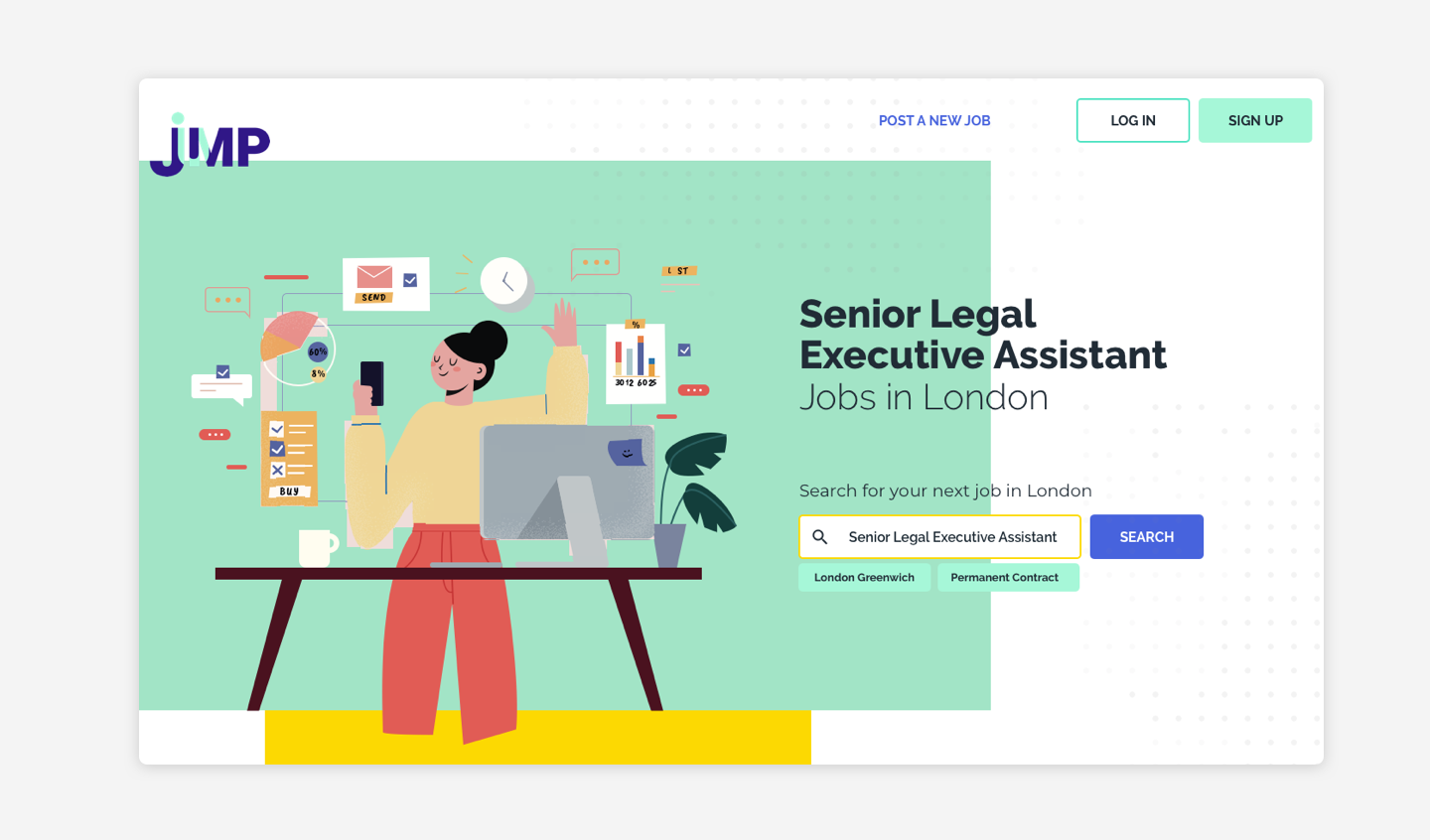
I added to the page header the job title together with the location (city or country), generating several job listing pages, one page for each combination of job title + location.

I included in the design a FAQ, so copywriters could create content to answer common questions searched by users (based on data analyses), while also emphasising key words to boost SEO.

I also designed several blocks of contents that could be used as flexible modules through the page, grouping similar jobs in a specific topic, repeating the main key-words across the page without actually repeating the content.
